Posts

Showing posts from April, 2020

Science Fiction - Life On Earth Exhibit Design Idea
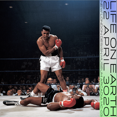
Image
This initial idea for promotional images/posters for the ‘Life on Earth’ exhibition takes iconic images from history as a way of representing Earth. The idea behind this is that perhaps photographs and images that haver been archived, will be one of the main sources of information that the new Martian civilisation would have about Earth.   The design of the banner is heavily inspired by the design of the Moving to Mars exhibit book design, using a modern sans serif typeface but with a more Earth inspired background colour.   Ethical Considerations - While these images would be a great way to represent earth to a future generation on mars, in regards to me using them for my designs now, I do not have the rights to use them. Re-reading the brief, it does say that the outcome should be a singular product or item. I have done a few branding projects where I have produced multiple items of collateral for a visual identity, but I think the...

Science Fiction - Earth in Retrograde

Considering the Moving to Mars exhibit a lot, humans looking into the future when we might be living on Mars, I had the idea to consider ,what would an exhibit look like on Mars in 3020 that looks back to when humans lived on Earth? This is almost the exact opposite, and considering this science fiction future on Mars, it’s really interesting to speculate how much this future ‘martian’ race would know about when we lived on earth.   I want to create some branding or a specific aspect of an exhibit on Mars in 3020 that is all about Earth and when humans lived there.     Things to consider 1000 years in future humans would have lived on mars for hundreds of years, there there won’t have been a human alive for hundreds of years who was actually on Earth. This means they’re view of earth and life on earth would be purely speculative and based solely upon knowledge and information which has remained and been passed down.   What information has remained? What...

Science Fiction - What does Graphic Design look like on Mars 3020?

Image
In creating a graphic design product from mars in 3020, a future science fiction artefact, I really have to ask myself (or at least speculate) what design looks like at this point.   Below is a selection of screenshots from various designer’s articles on ‘It’s Nice That’ when the keyword ‘futuristic’ is used to search the graphic design section. ‘Futuristic’ design is often sleek, technological, technical, elaborate, geometric, metallic, cold, fluid. I think the reason for this, is that one of the most fundamental things we can predict when looking into the future, is the development and advancement of technology, therefore people extrapolate this to visions of a future which is abundant with advanced technology, and this metallic, cold, efficient and technical aesthetic is a product of that.   However, if we’re assuming that in the future, humans will be on mars, how might this affect graphic design, and the way it is produced?   ...

PPP - Intern - Regular Practise Live Interview - Website/Personal Branding Research

Image
I watched the instagram live video of Regular Practise design studio talking to Intern Magazine about advice for design students during the current period of time. There were some really useful tips and advice that were talked about: Printers are still open - Like many people, I assumed that printing services would be closed during this period, and that I wouldn’t be able to print and photograph the work that I’m making for extended practise that I want to put in my portfolio. As it turns out, printing services are still available, which means I can still utilise these services. One of the sites that was suggested was ‘ YouLovePrint.com ' which after checking it out, looks like a really good site for getting professionally printed publications, posters and more at a fairly reasonable cost.   No one is expecting you to go above and beyond right now - A lot of people have been talking about things that design students should be doing right now to utilise their time as efficient...

PPP - Time Management

Image
On our ppp zoom chat today, one of the things discussed was time management. Being stuck at home I have found it harder to be productive because I don’t have a proper work space. So far, I have been managing my time and my projects by having a big list up on the wall which I can cross things off once I’ve done them. I think writing a list is a good way to be more productive because you can set yourself a few tasks to do and then it feels good to cross them off once you’ve done them. I have been giving myself 4 or 5 of the things on this big list to do in a day but I often don’t get all of them done. One helpful method was to set 4 tasks for a day, each being in an hour time slot; you can break these up a bit, maybe have 2 in the morning and 2 in the afternoon, but that way you are at least getting 4 hours of work done. I am going to try this method of time management and see how it goes: 10am - watch Intern live instagram talk and blog about it. 12am - PPP - self bran...

Science Fiction - Proto Science Fiction Research

Image
Proto science fiction describes fiction stories that came before science fiction and contained elements that would influence or develop into science fiction. The biggest difference in these stories is that they are not rooted within science, more so in magic, mythology or religion, however they do still tell tales of space travel, extra terrestrial life and more.   I researched proto science fiction because I started thinking about the design brief that I set myself for this project, to create a product or item from 3020 when humans live on Mars, so I thought maybe it would be useful to look at it retrospectively, and to consider what people thought the world would look like in the future a thousand years ago.   Here is an extract from an article named “History of Science Fiction Part 1” - ‘The history of science fiction truly begins before science fiction as a genre really started to take shape. Many old texts depict scenarios where man traverses beyond the l...

Science Fiction - Research Direction and Creating a Brief

I’ve done a fair amount of broad research, focusing in on mars as a key topic as a result of seeing the ‘Moving to Mars’ exhibit. Now I need to focus in on what I will be designing and do more in depth and specific research to inform that. I really don’t want to lose the fact that this is a science fiction research project and not a mars research project, a lot of facts and research about the mars missions could inform a really interesting outcome, and they have certainly been a valuable research point, however to make this truly a science fiction project, I want create something, an item or a product, that it in itself, will be a work of science fiction. To do this I need to extrapolate an aspect of technology or social tendency related to mars or colonising mars, and then speculate what particular item or product might exist in this future, as a result of this extrapolation. Like Syd Mead’s concept art for Blade Runner, which depicted a semi-familiar yet futuristic look at Los A...

Science Fiction - What We Discovered

Image
What We Discovered was a collaborative design workshop and publication led by designer Marek Nedelka which imagined artefacts, symbology and signage for future worlds. Each of the 10 chapters showcases the work of a different designer, and their response to this brief, and the near future or fictional world that they created.   This project is really interesting and a great point of research for this project, because extrapolating technology or social tendencies is the same process used to create science fiction, fundamentally these design ideas are works of science fiction.   One designer creates a set of ligatures to represent popular online abbreviations as text talk such as ‘omg’ or ‘lol’, while another creates a design for a new rosetta stone, backing up the most important information of our civilisations for species and generations that proceed us. The scale and output of these ideas varied, but all of the resultant designs were very refined and thought out. ...

PPP - Self Branding

Image
Thinking about self branding for my website I started putting some designs together. I’d previously decided I wanted the design to be fairly minimal so that the concentration was on the design, so I picked a fairly uniform sans serif font on a white background. Despite this, I do still want to add some level of visual intrigue so that it looks exciting. On Cargo Collective, one of the templates I looked at has images that pop up when you hover over the type, so I tested out what that might look like.  

Patience T-Shirt - Everpress

Image
Me and an illustrator collaborated on a t-shirt design in the summer, and after someone who works at ever press saw the design, they suggested putting it up there. We also got featured on the editors pick page. It was a good opportunity to get my work featured.

Hell Bay - Product Photography

Image
I started taking pictures on a white backdrop so that the focus was primarily on the designed products, however the images seemed a bit flat and boring. So I utilised light cast from a window against a white table as a background; this heavy use of light and shadow makes the images a lot more exciting and the light really brightens the surface of the paper and the designs on them. This use of natural light and shadow also gives the images a more physical quality and the bright sun light matches the natural beauty of the hotels setting.