Posts

Showing posts with the label Science Fiction

Science Fiction - Initial ideas and Development images

Image

Science Fiction - Star*Crossed development

Image
Covers - With colour and typography pretty much established for both covers, the main part of the development stage focused on how the type would be arranged on the covers. The designs from the initial ideas stage with the large scale type filling the cover were bold and had a higher level of visual intrigue, with the shape of the letterforms being larger and more dominant within the design. Some slightly more stripped back layouts were experimented with (1,2) these especially suited the Mars cover because the rational and uniform approach lent itself well to a more futuristic cover design. One aspect that worked really well was having the asterisk in the centre, surrounded by negative space. This asterisk almost depicted mars in space/the sky and its smaller scale paired with the negative space around it highlighted how distant the planet is.   At this point, it was decided that the 2 covers didn’t have to have the same layout; this cover for Mars (3) was...

Science Fiction - Star*Crossed initial ideas

Image
With the product for this research brief being a smaller component, acting as a culmination of this body of research and exploration of science fiction, there were a few ideas that were explored until one was settled upon; creating a science fiction poetry book that exists in the future when humans live on Mars.   Cover - The idea behind this publication was that it would be double sided, half of it being representative of Earth, and having poems evocative of Earth, and the other half being evocative of Mars. For this reason, a fairly intuitive initial approach was using red and blue, to represent the red planet and the blue planet. The next step was finding typography to represent the two planets. Fonts such as Eckmannpsych (1) and Cheee (2) were experimented with for the Earth cover because they’re curved, fluid and more organic. Cheee in particular has letterforms which look very inflated and liquid, so this idea was pushed further by adding highlights ...

Science Fiction - Poetry Book

Still considering a book or publication which exists in this science fiction future where humans inhabit Mars, I started thinking about poetry after seeing an article about a poetry competition in 2013 where 5 haikus were picked and put on the MAVEN spacecraft before it was sent to mars: ‘Outreach officials working for the  Mars  Atmosphere and Volatile Evolution Mission (MAVEN) are employing the Japanese-style poem to involve non-rocket scientists in the next mission to the red planet. In May they invited the public to enter poems, promising to select five winners that will be adhered to the MAVEN before it is launched towards Martian airspace. A 20-day launch window will begin Nov. 18.’ Thirty-six million miles of whispering welcome. Mars, you called us home. –Vanna Bonta, USA It’s funny, they named Mars after the God of War Have a look at Earth –Benedict Smith, United Kingdom https://swampland.time.com/2013/08/09/nasa-is-sending-these-...

Science Fiction - Book Design - Initial Experimentation

Image
I did some initial designs of the first page/cover of a book which uses space efficiently, as I conceived could be an approach to book/editorial design in a science fiction future. It looks incredibly cramped and crowded, because all the type is clustered together as tightly as possible. This idea really focused on function over form, even adding in the title was technically an unnecessary embellishment if the design is supposed to be as highly efficient as possible. I think its an interesting concept, but maybe concepts around this idea need to be explored, and I need to develop something which is both related to sci-fi and my project, but also has some more refined design.   The book I chose was Stranger in a Strange Land by Robert A. Heinlien, a sci fi novel about a human who was raised by martians, only to return to earth and became a figure of controversy due to his martian upbringing and the abilities he has gained as a result. I thought it was very applicab...

Science Fiction - Book Design

It takes around 150-300 days to travel to mars, which is the best part of a year. In the Moving to Mars exhibit, there was a quote from Buzz Aldrin saying the journey would give you enough time ‘to read the Iliad and the Odyssey’.   What struck me about this was that these are obviously massive texts, and the books would be very big, however one of the elements touched upon in the exhibit was that when humans do travel to mars, every fraction of space on the ship will have to be meticulously rationed and efficient. This is because the journey is so long, they won’t be able to get equipment and supplies easily, so they would have to pack what they bring very efficiently. So it struck me, would they even be aloud to bring such big books to read on the journey, if they are technically not essential? Could graphic design be used to maximise the space and efficiency of a book, distilling it down so that the content utilises as little space as possible?   Looking furthe...

Science Fiction - Initial Ideas, Evaluation and Idea Development

Image
I started coming up with some initial ideas for this Poster which would advertise an exhibit about life on earth, on mars in the future. The idea was to create something very evocative of the planet earth, emphasising water and nature, 2 aspects which would definitely be less existent on Mars in the future. The poster was supposed to be fluid and kind of illustrative, and feel very human and organic, with a touch of sci-fi inspired visuals to represent the future it was hypothetically made in.   After some self evaluation and peer feedback, I have decided to develop my ideas more and look to create something different for this sci-fi inspired product, for the following reasons: The idea felt too convoluted, a poster for an exhibition on mars in the future, when humans now live on mars, and the exhibition is about when humans used to live on earth, it makes sense and within my research, it was a logical step, however considering the finished result, I wan...

Science Fiction - Life On Earth Exhibit Design Idea

Image
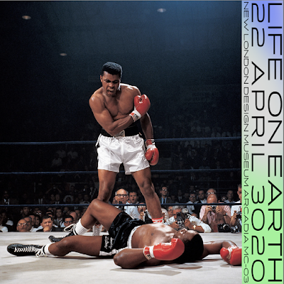
This initial idea for promotional images/posters for the ‘Life on Earth’ exhibition takes iconic images from history as a way of representing Earth. The idea behind this is that perhaps photographs and images that haver been archived, will be one of the main sources of information that the new Martian civilisation would have about Earth.   The design of the banner is heavily inspired by the design of the Moving to Mars exhibit book design, using a modern sans serif typeface but with a more Earth inspired background colour.   Ethical Considerations - While these images would be a great way to represent earth to a future generation on mars, in regards to me using them for my designs now, I do not have the rights to use them. Re-reading the brief, it does say that the outcome should be a singular product or item. I have done a few branding projects where I have produced multiple items of collateral for a visual identity, but I think the...