Posts

Showing posts with the label Hell Bay

Hell Bay - Product Photography

Image
I started taking pictures on a white backdrop so that the focus was primarily on the designed products, however the images seemed a bit flat and boring. So I utilised light cast from a window against a white table as a background; this heavy use of light and shadow makes the images a lot more exciting and the light really brightens the surface of the paper and the designs on them. This use of natural light and shadow also gives the images a more physical quality and the bright sun light matches the natural beauty of the hotels setting.

Hell Bay - Menu Design

Image
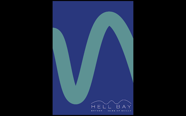
I was really happy with the way the designs came out for the backs of my menu’s, so I’ve decided to keep them that way. They also fit in really well with the rest of the branding, using the same colours, type and shapes. From here I just needed to add on the actual menu information, so that the menus are ready to print. I kept the typesetting of the menus fairly uniform so that it was in line with the typesetting of the brochure; both use Benton Sans Wide for the display font, and Benton Sans for the body text.  

Hell Bay - Final Brochure Developments

Image
Preparing to enter the production process, I reviewed my brochure design, added in the copy from the website, and changed a few of the design aspects on some of the pages.   This welcome page was feeling a bit flat to me before, the type was not laid out on the page like it is on the rest of the brochure, so I centred the text boxes on the first page, and made the second page more modular and split in layout, with the line pattern coming in in the corner.   I had to add in another spread for the brochure to be printed correctly, then I realised I hadn’t added in contact info. Similar to some of the other pages, I really like the contrast between the facing pages on this spread, especially with such a large amount of negative space on left page.   Now I need to consider printing methods, formatting and stock.  

Hell Bay - Hotel Branding Research

Image
Deutsche & Japaner - Speicher7 - This branding campaign is clean and simple, its beast features are its production and documentation/photography. Elements like the different parts of the menu which are all different sizes and stocks, slot in nicely together and impart a luxury feel. However one criticism I would have, which is quite a big one, is I don’t feel a strong brand or visual identity. The logo is in an elegant serif font, which suits the tone but isn’t very distinct. A lot of the printed matter has similar type, centred, small and minimal.   Bulgari Hotels and Resorts - Pentagram - Alternatively, this branding campaign from Pentagram, offers a very distinct visual identity for Bulgari Hotels and Resorts. Along with an individual logo mark, images of leaves appear as a recurring visual theme in all the dark sophisticated products and printed matter in this rebrand.   While both these hotels are not that similar to Hell Bay, t...

Hell Bay - Alternative Design Idea

Image
This bright geometric design for the Hell Bay visual identity was an alternative route I went down. After creating that curved line that appears in the final logo, I filled it in as a shape, appearing like a chunk of land on the horizon, this then became more pictographic and illustrative, adding in the sun and moon and literally reprinting the view and horizon. Further down, I started using these shapes in a more abstract way, were they don’t appear in the rational way they would normally, and did some colour variants to represent different times of day. Ultimately, like a lot of design that I’ve done for this project, its very geographical and evocative of the landscape, which as I’ve mentioned previously, I think is a big part of branding a hotel like this; its isolated on a tiny island, so if you’re going there, you’re likely going for the scenery and location.   My supervisor really liked the boldness of these designs, especially some of the editorial layouts such a...

Hell Bay - Development and Production Ideas

Having finished my placement with this project basically finished, I’m now at the point where I need to decide how and what I am going to develop and produce for this project. I would like to produce a few things that I can photograph nicely for documentation and my portfolio. The brochure is one of the more developed and bigger points of the project so I think I will produce that, I just need to finalise the designs and add in some content, I can probably get the actual text that I’m going to put in from the website. I also want to produce the menus and the ‘do not disturb’ signs; these are typical hotel objects so it would be nice to print/produce something that isn’t a poster or a publication, as with a lot of projects. Also hopefully upon producing these, I will be able to take some nice shots of them in context.   For the rest of the designed elements, I can create a final pdf deck which I will also submit.   I would also like to take a bit of a step back and...

Hell Bay - Developed Deck

Image
After getting feedback from my supervisor about how I could develop this visual identity, I prepared a new deck of mockups featuring my new designs. After working on the editorial for a quite a bit till I was happy, a lot of aspects like the posters and the menu’s just came naturally from one of the pages that I thought worked very well, the thicker line that winds down the page. When the visual identity becomes distinct and individual enough, some of the parts are incredibly intuitive to produce, because the identity has already been established.   This shows the changes I made to the logo, just simplifying the sub header and laying it out more rationally, I think the structure of the logo definitely works better.   The front and back cover designs overlap into one whole image of the line winding down. I’ve used this quite a lot within the designs however I like that its part of the logo but also incredibly integrated within the identity. It also co...

Hell Bay - Editorial development 2

Image
More experimentation and development of my editorial layouts, looking at colour and different ways to apply the line throughout.