EOYS Branding - Research
GI2018 - Cause and Effect - “Glasgow International is Scotland’s largest festival for contemporary art, taking place across three weeks every two years. As a festival that places Glasgow in the international spotlight of the art world, it’s one that requires an identity which embodies the city’s personality and translates this on a global scale. For this year’s festival – Gi2018 – this responsibility fell to Kerr Vernon and Ed Watt of Glasgow-based studio, Cause & Effect.”
This visual identity for Glasgow international festival is very bold and succinct. The bright yellow, green, purple and pink colours used are instantly attention grabbing however are often used simultaneously with large amounts of white space so they’re not too overpowering. The diamond shape which forms the basis of the visual identity is the shape of the tittle from the typeface ‘lacuna’ - created by a graduate of the Glasgow school of art. This typeface is also used for the display font. Ultimately the whole campaign is bold, rationalised and refined, a great example of how research can lead to very fundamental aspects of the campaign, and how these aspects can be applied simply and effectively.
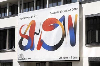
Royal College of Art Degree Show - Regular Practise - “For the second consecutive year (the year before that they were exhibiting in the show as students) design studio and It’s Nice That Ones to Watch, Regular Practice, have designed the Royal College of Art’s graduate show identity.”
This visual identity for Royal College of Arts degree show shows a different yet just as successful approach to creating a cohesive and intuitive branding campaign for an event. While Cause and Effect creating a graphic language with shape, colour and type, and applied this to the various touch-points they created, Regular Practise created this contemporary calligraphic type simply for the word ‘show’ and this became the centrepiece for their whole visual identity. The calligraphic marks are so fluid and engaging, they even vary between different touch-points. The contrast of this and the incredibly minimal approach to the rest of the design, rational sans serif type on a white backgrounds demonstrates this intriguing marks ability to carry the whole identity. A great example of how one very bold and eye catching visual device can capture attention and fundamentally form the whole identity.
Unfold - A Black Cover Design- “A Black Cover Design is a creative studio based in Beijing, China, founded by Guang Yu and Nod Young in 2015. Guang and Nod’s award-winning practice works across branding, strategy and print design; most often with cultural institutions, universities, and art and design festivals. Recent work includes the identity for Shanghai’s first art book fair, Unfold; a poster campaign for AGI China; and printed matter and merchandise for Tokyo TDC Selected Artworks. We spoke to Guang about inspirations, problem-solving and why “suitable” is best.”
This identity for Shanghai’s first art book fair ‘Unfold’ is really simple and effective. With a consistent application of colour, shape and typography, these designed touchpoints for the branding of this festival all clearly lie within the same visual identity. Not only is the design engaging, its also evocative of the context of the book fair with the different coloured overlapping boxes taking of paper or different pages stacked on top of one another.


Comments
Post a Comment