East Village - Final Touchpoints
From here all the other aspects of the visual identity came rather intuitively. I think when you put in the time to create a succinct and well rationalised brand identity, after that if you’re just creating fairly simple products within it, it shouldn’t be too hard.
One thing that we were keen on creating was the banner which showed the different ‘Classic Cocktails’ on the menu. I worked on this. I went through a few different ideas of how to apply the brand identity to it once I’d typed up the chart in the typeface we were using ‘Montag” on a black background. A lot of these had good ideas, such as the 4 different colours of the brand being the 4 different sections on the chart, but ultimately it become a bit too convoluted. We ended up favouring a simpler chart with the star in the background. Thinking about the application of this banner, and what space it would inhabit in the real world, it would be in the back of the bar, therefore it would be nice to show the star very largely to highlight the visual identity.
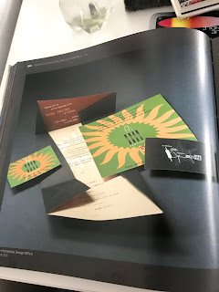
I did some more research into branding for bars and looked at this slightly outdated book about it. Ultimately the fact it was slightly outdated matched the un-sophisticated nature of dive bars well, and it gave us an idea to do matchboxes instead of business cards. Match boxes are common on dive bars and they add a higher level of utility than business cards because people actually use them and therefore keep them. Since this would be something that someone would take away out into the public, we applied the star on a black background with no info on it.
We really liked the way thew stars appeared on the black circles so we thought they would make nice coasters. When it comes to braiding somewhere like a bar, you’ve got to regally think about the space and how these things will look and act within that space. Even just creating coasters with the logo on just solidifies the brand. Also we thought it would be good to make stickers with these logos on just like these designs on a black circle. This could be another form of advertising where just the star is shown and nothing else. You get a lot of stickers in dive bars on the bar and walls etc. and people often put stickers like this in bar/pub toilets so its almost like a little form of guerrilla advertising, and another platform to add intrigue to the brand by people recognising, but not knowing what this star is.
Lastly we needed to do the menu. Jamie did a few designs and sent them to me with the intention for the menu to be a single A4 or A3 sheet. They’re very uniform and display the logo frequently, however we discussed that they were a bit crowded and maybe by doing a folded, 2 sheet A5 menu, there would be a bit more space in the designs.
After this, I did a few designs ,taking inspiration from Jamies designs, but also from the aesthetic of the event posters that we had created. We each played around with these designs and ultimately came up with a final combination that we liked.


Comments
Post a Comment