New Music Market - Design For Screen Research
Since this project is in response to the digital consumption of music, I decided it was definitely necessary to design screen components for it. Since a lot of people listen to music on their phones, I want to do some designs for a mobile application for the New Music Market. I want the design and layout of this application to fit with the design aesthetic that I have identified for the branding of New Music Market - contrasting the mundane visual identities of supermarkets with something bolder and more contemporary, reflecting the younger target audience of the service.
I started by researching some screen based design for supermarkets, looking at Tesco’s mobile app; The UI and UX are centred around rationality and being intuitive, product images and prices are very clear, with the ‘add to bag’ button being very large, potentially as a way to visually persuade users to purchase the item. Offers and sales are shown in yellow to contrast the blue of the visual identity in order to stand out, other than this, the colours used are just blue for banners and buttons with a white background, emphasising clarity and ease of use.
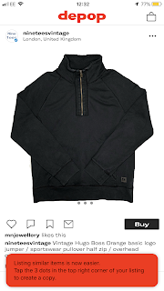
In contrast I then looked at the UI/UX and visual identity of Depop, a clothes selling app which has a target audience that correlates with that of New Music Market; this younger trendier target audience is clear through the more geometric, capitalised sans serif font, creating a bolder image, and also the more liberal use of the bright red spot colour used in the UI/UX, again highlighting boldness. This idea is also seen on pages where multiple images appear next to each other; on the Tesco app, these images, the products, are isolated inside boxes, however on depop, the images slot together tightly in squares for a more dynamic aesthetic.
Thinking about how the design aesthetic can carry across from the mobile application to aspects of branding such as posters and advertising DesignStudio’s global ad campaign for Depop certainly presents a visual identity succinct with the Depop application, fully realised in advertisement form. I like the minimal approach of simply typesetting quotes and comments on the bold red background, it’s simple yet still very evocative of the brand because they use the same typeface and colour present in Depop’s visual identity. How can I use an approach like this to create an integrated brand identity and also tie it in with the mundane aesthetics of supermarket branding?


Comments
Post a Comment